Dither Reveal
An image that resolves from dithered palette tones into the photo.
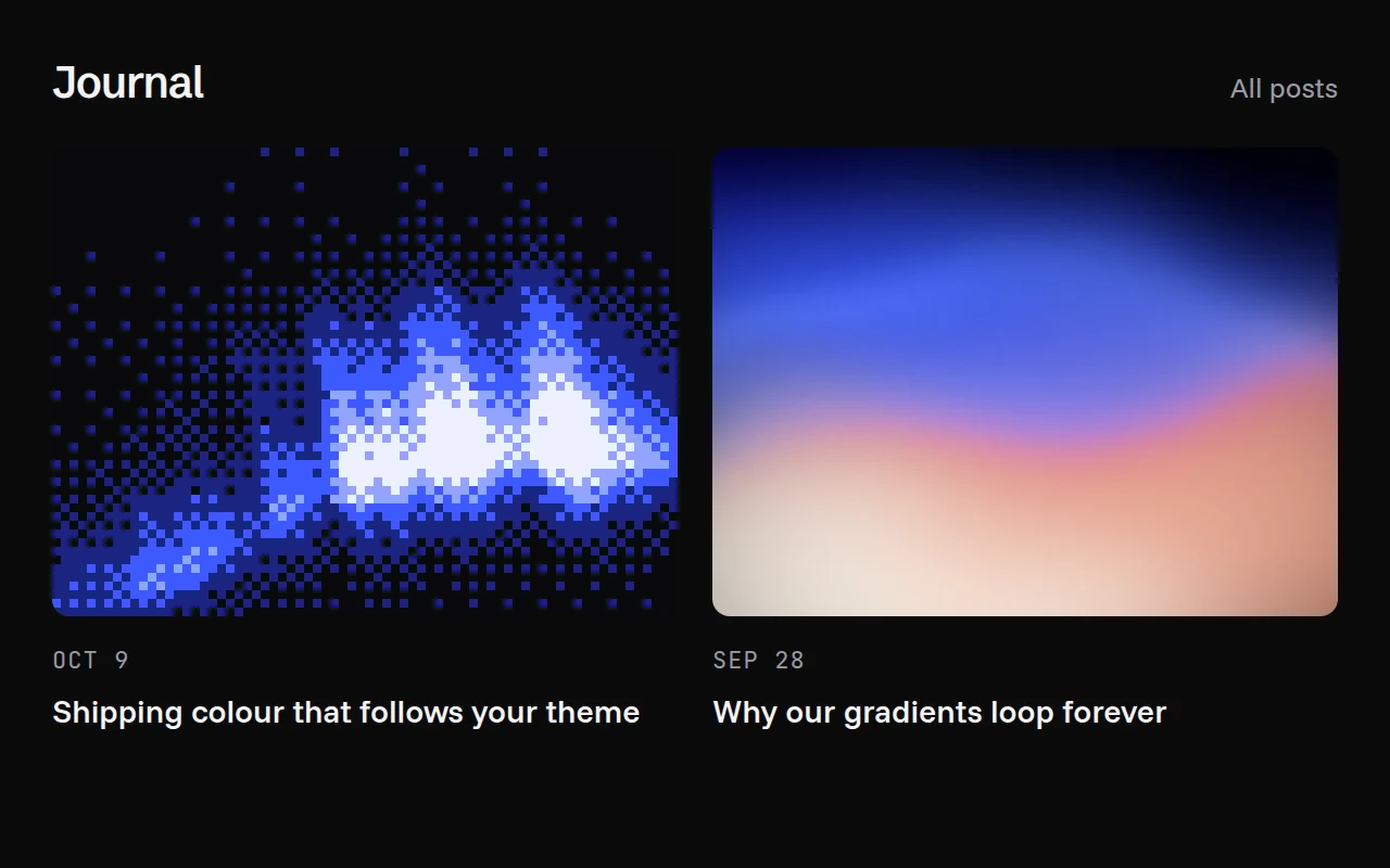

import { DitherReveal } from "@/components/dither-reveal";

export function PostCard() {
  return (
    <a href="/blog/launch" className="group block w-80">
      <DitherReveal
        src="/blog/launch.jpg"
        alt=""
        className="aspect-[4/3] rounded-lg"
      />
      <h3 className="mt-3 font-medium">We launched</h3>
    </a>
  );
}
Installation
pnpm dlx shadcn@latest add @gradients-pro/dither-revealNeeds a Pro account and the Pro registry setup.
Usage
import { DitherReveal } from "@/components/dither-reveal";

<DitherReveal src="/photo.jpg" alt="" className="aspect-[4/3]" />;
Props
| Prop | Type | Default | Description |
|---|---|---|---|
src | string | required | The image. Images on another origin need CORS headers and crossOrigin. |
alt | string | required | Alternative text, passed to the <img>. Use "" when a nearby heading already describes it. |
trigger | "hover" | "visible" | "manual" | "hover" | "hover" reveals on hover and focus within; "visible" reveals once when half of it scrolls into view; "manual" follows revealed. |
revealed | boolean | false | With trigger="manual", shows the photo when true. |
palette | "ultramarine" | "ember" | "mono" | string[] | "ultramarine" | A curated ramp, or your own 2 to 6 CSS colours from faint to hot (var(--x) included). Curated ramps switch between a light and a dark version with your theme. |
base | string | near-black or paper | Colour of the darkest cells. |
cell | number | 4 | Size of one dither cell in CSS pixels. |
duration | number | 900 | Milliseconds for the dissolve. |
scheme | "light" | "dark" | follows the page | Forces a colour scheme. By default it reads a dark or light class (or data-theme) on <html>, then the system setting. |
crossOrigin | "anonymous" | "use-credentials" | none | Passed to the <img>. |
children | ReactNode | none | Drawn above the image, for captions and badges. |
className, other div props | The outer box. Give it a size, such as aspect-[4/3]. |