Glass Panel
Frosted glass over a live dither field.

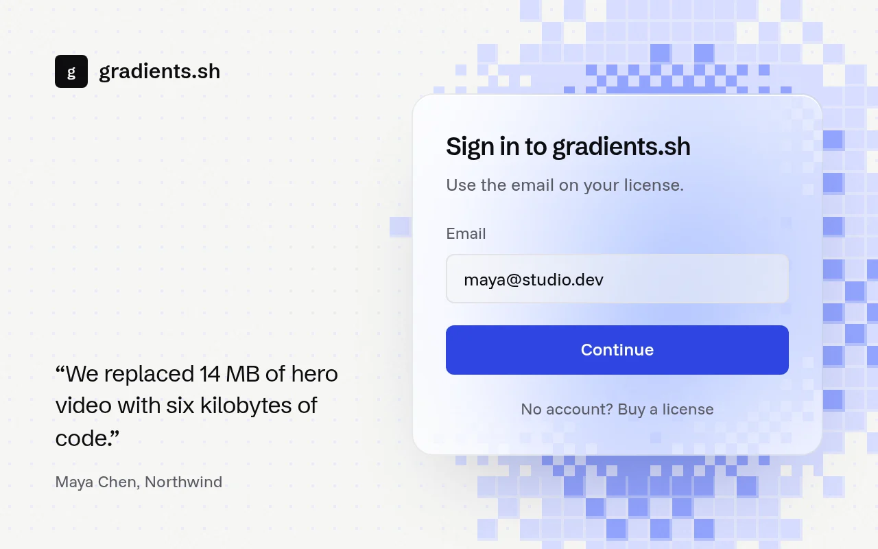
import { GlassPanel } from "@/components/glass-panel";

export function SignIn() {
  return (
    <GlassPanel
      className="grid min-h-[560px] items-center p-10"
      panelClassName="w-80 p-6"
    >
      <h2 className="text-xl font-semibold text-white">Welcome back</h2>
      <p className="mt-2 text-sm text-white/70">Sign in to your workspace.</p>
    </GlassPanel>
  );
}
Installation
pnpm dlx shadcn@latest add @gradients-pro/glass-panelNeeds a Pro account and the Pro registry setup.
Usage
import { GlassPanel } from "@/components/glass-panel";

<GlassPanel className="min-h-[560px] p-10" panelClassName="w-80 p-6">
  {children}
</GlassPanel>;
className lays out the field; panelClassName sizes the glass.
Props
| Prop | Type | Default | Description |
|---|---|---|---|
palette | "ultramarine" | "ember" | "mono" | "ultramarine" | A curated ramp that follows light and dark mode. Ignored when colors is set. |
kind | GradientKind | "dither-field" | Any registered kind for the field. |
colors | string[] | none | 2 to 6 CSS colours. |
background | string | var(--background) | Base colour of the field. |
tint | "light" | "dark" | follows the page | Frost toward white or toward black. |
frost | number | 0.6 | 0 to 1. How much the glass blurs what is behind it. |
radius | number | 16 | Corner radius of the panel in pixels. |
speed | number | kind default | 0 to 2. How fast the field drifts. |
params | Partial<GradientParams> | none | Any other engine param, applied last. |
className, style | The outer box that holds the field. Lay out the panel with it. | ||
panelClassName, panelStyle | The glass panel itself, for size and padding. | ||
aside | ReactNode | none | Content on the field before the panel, such as a brand column. |
children | ReactNode | none | Content inside the glass. |