Spotlight Grid
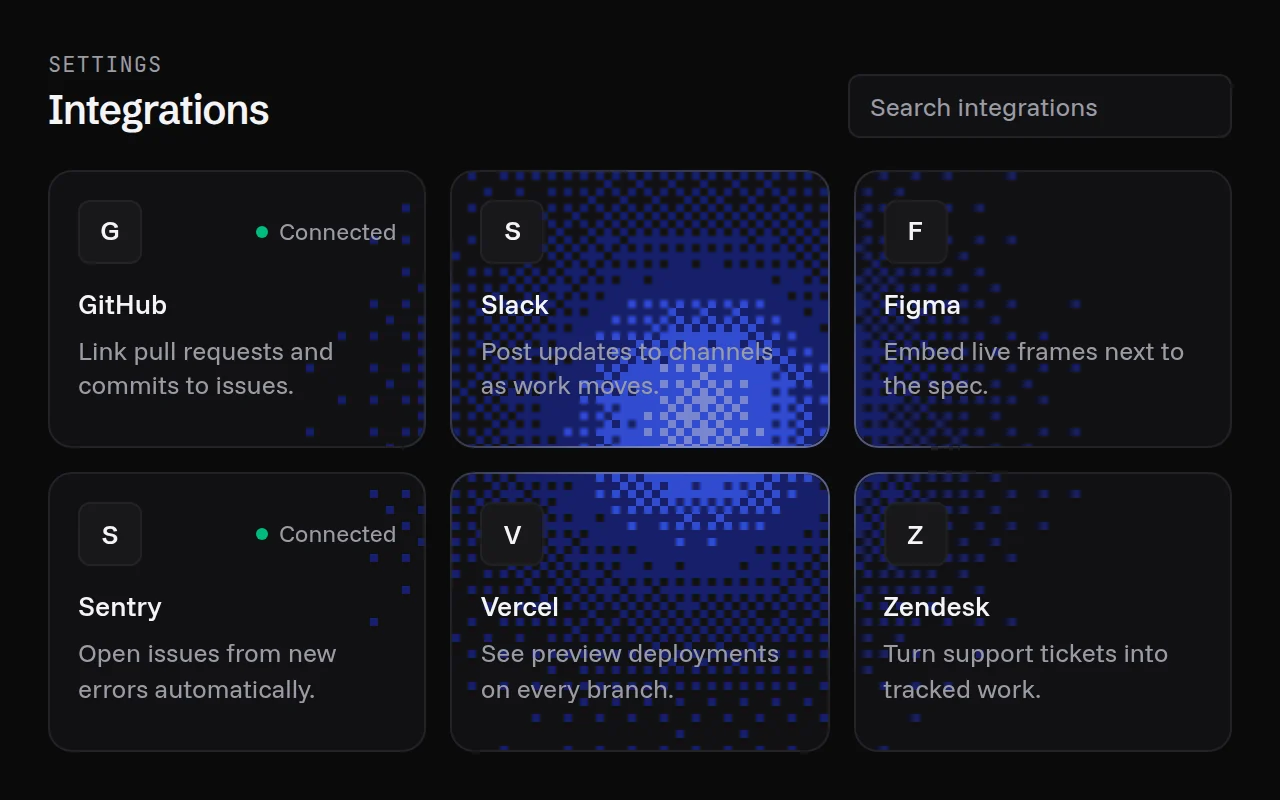
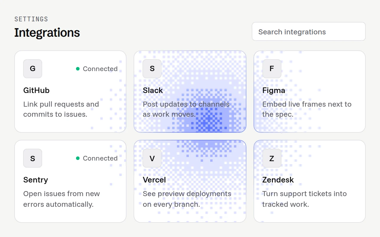
One dithered light under a grid of cards.
import {
  SpotlightCard,
  SpotlightGrid,
} from "@/components/spotlight-grid";

const integrations = [
  { description: "Deploy previews on every push.", name: "GitHub" },
  { description: "Post release notes to a channel.", name: "Slack" },
  { description: "Sync issues both ways.", name: "Linear" },
];

export function Integrations() {
  return (
    <SpotlightGrid className="grid gap-3 sm:grid-cols-3">
      {integrations.map((item) => (
        <SpotlightCard key={item.name} className="rounded-xl border p-4">
          <h3 className="font-medium">{item.name}</h3>
          <p className="text-sm opacity-70">{item.description}</p>
        </SpotlightCard>
      ))}
    </SpotlightGrid>
  );
}
Installation
pnpm dlx shadcn@latest add @gradients-pro/spotlight-gridNeeds a Pro account and the Pro registry setup.
Usage
import { SpotlightCard, SpotlightGrid } from "@/components/spotlight-grid";

<SpotlightGrid className="grid grid-cols-3 gap-3">
  <SpotlightCard className="rounded-xl border p-4">{children}</SpotlightCard>
</SpotlightGrid>;
Props
| Prop | Type | Default | Description |
|---|---|---|---|
palette | "ultramarine" | "ember" | "mono" | string[] | "ultramarine" | A curated ramp, or your own 2 to 6 CSS colours from faint to hot (var(--x) included). Curated ramps switch between a light and a dark version with your theme. |
radius | number | 240 | Radius of the light in CSS pixels. |
intensity | number | 0.34 | 0 to 1. How hot the centre of the light gets. Keep it low behind text. |
cell | number | 4 | Size of one dither cell in CSS pixels. |
scheme | "light" | "dark" | follows the page | Forces a colour scheme. By default it reads a dark or light class (or data-theme) on <html>, then the system setting. |
edgeColor (card) | string | the palette's accent | Colour of the border where the light touches it. |
className, other div props | Passed to the grid or card element. |