Glow Tabs
Underline tabs with dithered light rising from the active line.
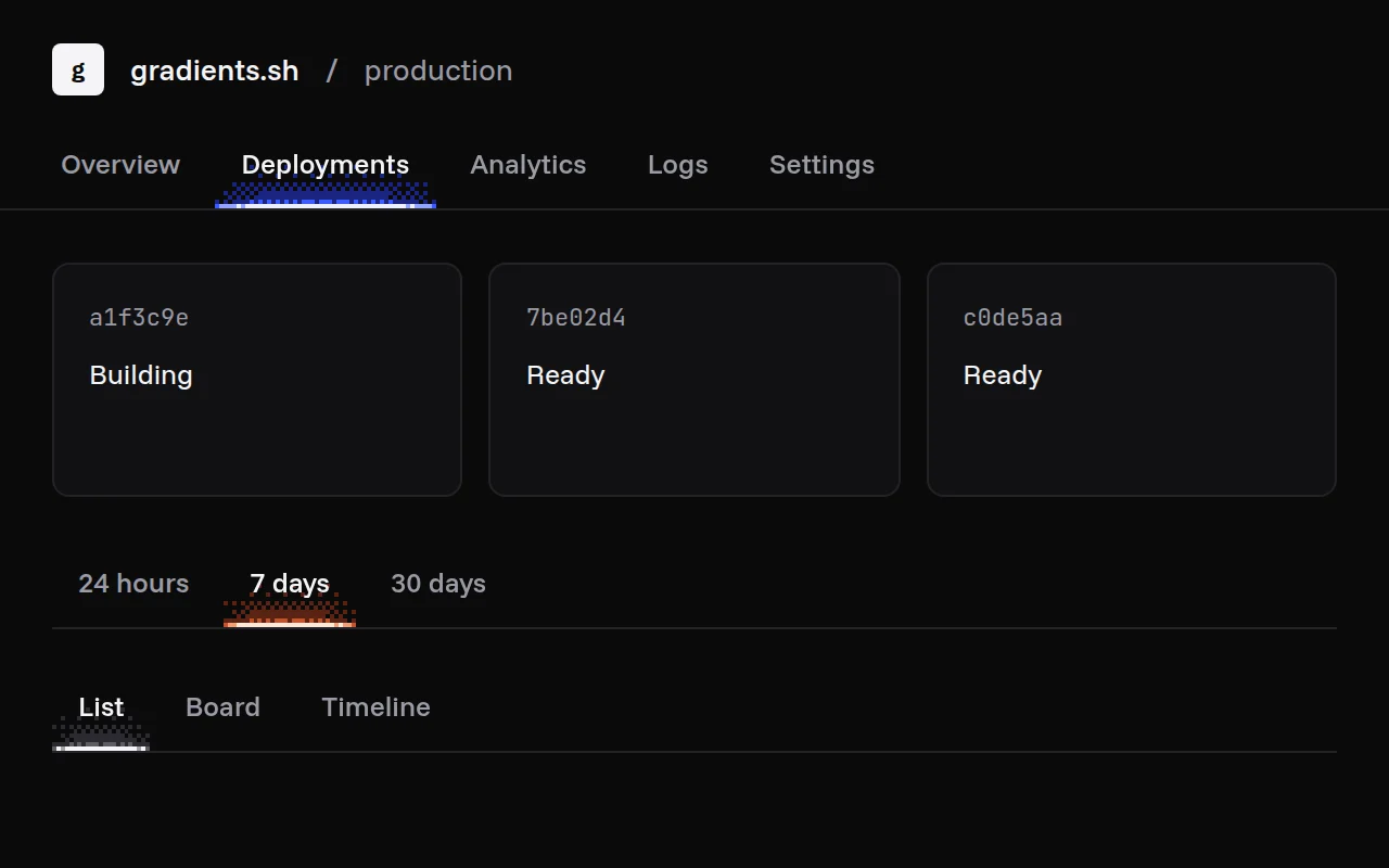
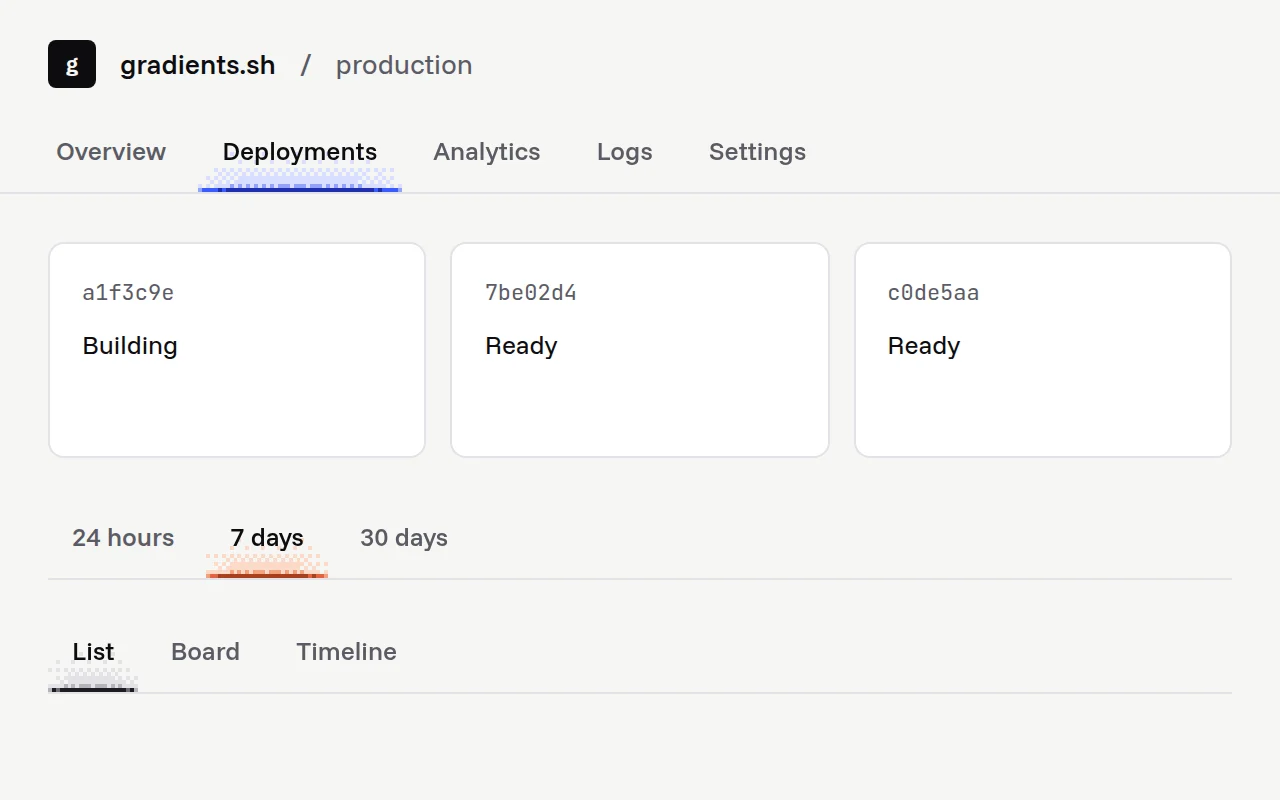
import { GlowTabs } from "@/components/glow-tabs";

export function ProjectNav() {
  return (
    <GlowTabs
      label="Project"
      defaultValue="deployments"
      tabs={[
        { label: "Overview", value: "overview" },
        { label: "Deployments", value: "deployments" },
        { label: "Settings", value: "settings" },
      ]}
    />
  );
}
Installation
pnpm dlx shadcn@latest add @gradients-pro/glow-tabsNeeds a Pro account and the Pro registry setup.
Usage
import { GlowTabs } from "@/components/glow-tabs";

<GlowTabs label="Project" tabs={tabs} onValueChange={setTab} />;
Props
| Prop | Type | Default | Description |
|---|---|---|---|
tabs | GlowTab[] | required | The tabs: value, label, and optional panelId (sets aria-controls) and disabled. |
label | string | required | Accessible name for the tab list. |
value | string | none | Controlled value. |
defaultValue | string | first tab | Initial value when uncontrolled. |
onValueChange | (value: string) => void | none | Called when the user picks a tab. |
palette | "ultramarine" | "ember" | "mono" | string[] | "ultramarine" | A curated ramp, or your own 2 to 6 CSS colours from faint to hot (var(--x) included). Curated ramps switch between a light and a dark version with your theme. |
cell | number | 2 | Size of one dither cell in CSS pixels. |
scheme | "light" | "dark" | follows the page | Forces a colour scheme. By default it reads a dark or light class (or data-theme) on <html>, then the system setting. |
className, other div props | Passed to the tab list. |