Liquid Blob
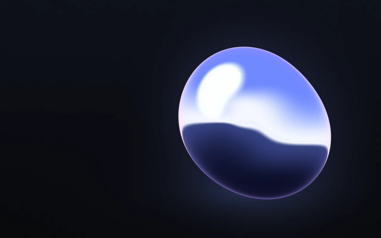
A drop of liquid chrome slowly reshaping in a studio.
import { LiquidBlob } from "@/components/liquid-blob";

export function Hero() {
  return (
    <LiquidBlob className="flex h-[560px] items-end p-10" palette="gilt">
      <h1 className="text-5xl font-semibold tracking-tight text-white">
        Your headline
      </h1>
    </LiquidBlob>
  );
}
Installation
pnpm dlx shadcn@latest add @gradients-pro/liquid-blobNeeds a Pro account and the Pro registry setup.
Usage
import { LiquidBlob } from "@/components/liquid-blob";

<LiquidBlob className="h-[560px]">{children}</LiquidBlob>;
It fills its box, so give it a height. Children render on top.
Props
| Prop | Type | Default | Description |
|---|---|---|---|
palette | "mercury", "gilt", "opal" | "mercury" | One of the curated palettes. |
appearance | "auto", "dark", "light" | "auto" | Which version of the palette to use. auto follows a dark or light class (or data-theme) on <html>, then the OS setting. |
colors | string[] | palette | 2 to 6 CSS colours, var(--x) included. Replaces the palette's colours. |
background | string | palette | Replaces the palette's background. |
size | number | 1 | 0.25 to 4. Size of the drop. |
stretch | number | 0.5 | 0 to 1. How far the drop pulls apart as it moves. |
softness | number | 0.25 | 0 to 1. Softer reflections and a wider horizon. |
grain | number | 0.08 | 0 to 1. Film grain. |
speed | number | 0.6 | 0 to 2. How fast it moves; 0 holds a still frame. |
params | Partial<GradientParams> | none | Any other engine param, applied last. |
className | string | none | Classes for the outer box. Give it a size, for example h-[560px]. |
style | CSSProperties | none | Inline styles for the outer box. |
children | ReactNode | none | Content drawn above the background. |